Scott Morrison Photography web site
Create and dcocument a web site for a photographer.
Paola worked with Bill Jones of Jones Design Associates to design and build a small web site for the photographer, Scott Morrison.
The purpose of a site was to generate interest in his work by people are sent a mailer, seen an ad or who have heard about him through word of mouth.
Paola started the project by reviewing other photographers' web sites; she wanted to see how photos could be navigated and what steps photographers took to protect copyright.
The site was to contain photos grouped by theme. Paola suggested the addition of an information pages and that thumbnails link to pages with the photo in a large size.
Icon- and colour-coding
![]() Each section of the site was icon- and colour-coded. Every page included Scott's phone number and navigations links to the home page, the three photo theme pages and the information page.
Each section of the site was icon- and colour-coded. Every page included Scott's phone number and navigations links to the home page, the three photo theme pages and the information page.
These links were implemented in a combination of a graphical button (to convey the section icon and colour) and an HTML text link.
The section colour was applied to the button, page tile, text label (unlinked) and telephone graphic. The section icon was applied to the section button and a section graphic.
The combination of graphic with an HTML text link has several advantages:
- Section colour and icon can be easily conveyed in a graphic
- People recognise colour before shape and shape before text
- The use of shape and colour answers "where am I?" and "how do I get back to...?"
Button states
Paola asked the designer to make two version of the buttons, showing "clickable" and "unclickable" and made the decision that button labels would be implemented as separate HTML text links rather than be part of the button graphic.
When she constructed the web site, Paola used formatting of bold and section colour to denote the level of a page in the web site:
- Level 1: (home page) button clickable, text label linked
- Level 2: (section page) button unclickable, text unlinked, in section colour and bold
- Level 3: (photo page) button clickable, text label linked and bold


Separate HTML text links have several advantages:
- the text can be resized in the browser
- can be translated
- they're easier to change
- quicker to download
- (usually) easier to read
- conforms to WAI accessibility guidelines
Photos
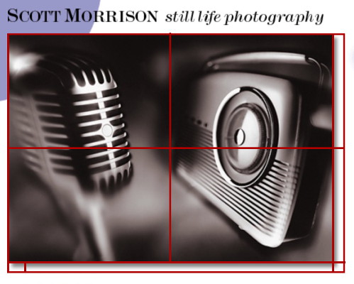
To present the photos at their best whilst not making them easy to copy, Paola decided to split each photo into four pieces.
Photos could still be copied by making screenshots; slicing the images made it cumbersome to save images from the page. It also thwarts robots which take copies of web site graphics and search engines which provide an image search facility.
Photo pages showed photos with a drop shadow - these weren't part of the photo graphics but were separate 16-colour graphics that were appropriately stretched and placed alongside the bottom and right edges of photos.
The advantage of this implementation is that the drop-shadow graphics could be cached and the photo compression level could be lower.
File size targets were set for thumbnails (5K) and larger photos (50K).
Pages tiles
The design called for a cropped circle in the top-left corner of the page.
Although Scott wanted pages to work with minimum vertical scrolling, Paola created tileable page tile images so that circles would appear complete at large screen resolutions.
File-naming system
The manual also documented the file-naming convention used for web pages and graphics. Paola had used similar file-naming conventions for many years with web sites, for instance using a prefix b- for buttons and h- for headings in combination of a section name (or 4-letter id).
The advantages of a naming scheme include being able to locate specific images quickly and to be able to reference groups of files by their name parts.
Manual
The web site was to be hosted by Scott's ISP and maintained by someone else - Paola prepared a maintenance manual and style guide.
The maintenance manual explained how pages were constructed and highlighted mark-up conventions; the style guide gave details of the section colours and how they were used. Step-by step instructions were given how to update or add new photos to the site.
After the site was made public, we spent a day registering it with the main search engines, sending a summary report to Scott.
Scott commented that the quality of the large photos on his site were better than the ones he had at a well-known stock photography web site.
")
")
")
")
")
")
")
