OED Online Tour
OED Online is an online subscription service to the 20-volume second edition of Oxford English Dictionary (OED). It also provides access to later Additions, and revised and new entries that are added quarterly.
The Oxford University Press (OUP) invited Paola design and build a tour of OED Online to add to the public OED web site.
Purpose of the OED Online tour
An online tour of OED Online would serve several purposes:
- a sales tool for potential subscribers
- a product overview for new subscribers
- help for librarians who support the service at subscriber institutions
- information for the media
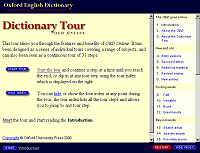
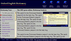
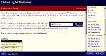
OED Online Dictionary Tour, 2000
Features of the tour
The main features of the tour are:
- Structured as a series of consecutive tours
- A tour index (of 31 tour steps) is available on every page
- Visitors can follow the tour in order
- Visitors can jump to any tour step
- Works at 640x480 and is better at higher screen resolutions
- Minimum dithering on 256-colour displays
- Visitors can hide the tour index
- Features full-sized screenshots from OED Online
- Uses frames, but each tour page can be individually bookmarked or referenced
- Framed pages can be correctly reframed if seen out of context
- External stylesheet creates a consistent style
- No plug-ins, non-standard technologies or server-side software needed
Tour navigation
Research other tours
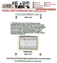
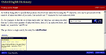
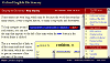
Paola searched for other web-based tours of web services; surprisingly, very few could be found via search engines. She found four of interest and passed the addresses onto OUP with comments on the presentation and functionality.
In one, screen-shots were too small to be of any use. Another included previous/next links for linear navigation and a pull-down list to jump to another tour step.
One of four web-based tour examples of web services found in 1999
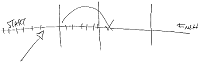
Tour structure
As a result of this review of other tours, Paola proposed the idea of a "grand tour" comprising individual tours on specific subjects.
Each tour would consist of a number of "tour steps" covering a specific subject. The next tour step at the end of one tour would be the first step of the next tour. Visitors could read the whole tour in a linear way, by way of a "next" link on each tour page, or they could go to any tour step in any order.
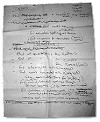
Sketch from a meeting
Planning workshop
Paola spent a day with OUP to discuss and agree tour content. She ran the workshop which started off by making two lists, one of OED Online's features and benefits and the other of specific questions that OED users would want to ask of the material such as: "find quotations in a particular work" (e.g., Faulkner's Hamlet rather than Shakespeare's).
She organised the features and benefits in a way that could be told in a linear story form; we agreed a principle that the tour would only discuss subjects that could be illustrated with actual examples by use of screenshots.
This resulted in seven individual tours; the content for each of these was sketched out on a large piece of paper, referring to the original lists to make sure that all features, benefits and tasks had been accounted for.
After the workshop, Paola wrote up and refined the tour structure. The next stage was to agree the headings for each tour and tour step, as well as how the tour was to refer to itself (e.g., "tour step" or "tour stop").
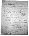
Notes from the planning workshop - listed features & benefits, and user tasks
Page layout
This structure entailed having the tour index available at every web page. As a result of their market research, a requirement from OUP was that OED Online and other site content had to work on 640x480 screen resolutions. This meant that a vertical tour index would use up valuable screen space.
Paola decided to introduce a feature to hide the index; visitors could click a 'hide' button so that the tour content could occupy more horizontal space. Once hidden, the index would remain hidden until the visitor chose to redisplay it.
It was clear that the tour index had to be vertical. Paola initially tried the traditional left-hand approach. At 640x480, the index overwhelmed the tour content.
Prototype (and diagram) of page layout with draft content
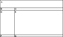
Paola moved the tour navigation to the right and found that the layout worked much better.
The purpose of the tour index was recognisable by its layout and formatting; Paola felt that putting it on the right-hand side removed any distraction from the tour content whilst being easy to locate and use when necessary.
By end of this process, Paola had prototyped five different page layouts.
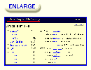
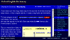
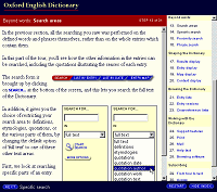
Tour step 11 shown with and without the right-hand tour index
Content
Once the tour structure was agreed, Paola wrote the initial draft of the tour text, taking account of where the planning group had said there should be a screenshot from OED Online. OUP made a list of the actual examples to use and Paola made screenshots from the beta OED Online.
Screenshots in the tour
The tour would not work well if the screenshots were only available full-sized; it was obvious that they would initially have to appear as thumbnails. OUP made the great suggestion that when a thumbnail was clicked, that it expand in context of the tour text - that is, a visitor could continue reading rather than have to go "back" to the tour.
The implication of the suggestion was that there would be an additional content web page for every enlarged image that could be shown; clicking on a thumbnail would display the content page with the same text but with the full-sized screenshot in place of the thumbnail. The frames approach meant that only the content frame would have to change which would speed up display.
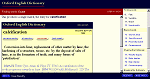
Tour step 11 with resized screenshot from OED Online
Resize
Paola experimented with different thumbnail sizes. Because the tour presented a text-based service, the thumbnails were always illegible. A set of thumbnail graphics would increase the tour size. She went for an unconventional (at that time) approach: rather than have a set of thumbnail graphics, thumbnails were based on the full-sized screenshots and resized in HTML as a percentage width (25%).
This meant that the actual thumbnail size depended on the visitor's browser width (and screen resolution). Because the thumbnail was also the full-sized screenshot, thumbnails expanded very quickly. The frames approach meant that the 9K tour index was only downloaded once (and then cached). The full-sized images were around 32K each - it was decided that this was an acceptable download time if most people expanded thumbnails.
Thumbnails were headed by an "enlarge" button in the button style used on OED Online. The thumbnail itself was a link to the full-sized screenshot.
Thumbnail with (enlarge) button
When a thumbnail was clicked, the content frame was updated with a new page in which that particular image was shown full-sized, with the image shown at the top of the page.
It was decided to do this in case people didn't realise that the tour text continued below the full-sized screenshot.
Tour step 11 showing a full-sized screenshot from OED Online
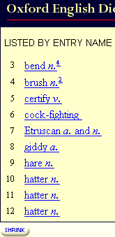
The full-sized screenshot was followed by a "shrink" button. Both the button and the full-sized screenshot linked to the page with only thumbnails.
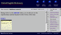
Paola added a panel at the top of each full-sized screenshot taken from OED Online. It included the brand identity (the OUP logo in the house style) and the site URL (www.oed.com) in case the image was seen out of context.
The full-sized screenshot displays immediately
At the end of this content phase, near-final text, screenshots and other tour images had been added to the prototype.
The next stage was to apply the visual design.
The last layout prototype before starting the exploration of colour combinations
Visual and graphic design
Paola approached a graphic designer only after the page layout and content prototype had been completed.
Bill Jones, of Jones Design Associates, had worked as a Senior Designer for Denison Design and had worked on the original OED marketing web site in 1998.
The design brief from OUP was to use their brand colours and to stay recognisably close to the style already used by the OED web site and OED Online. However, there was freedom to explore alternative button styles, such as the use of icons.
Brand colours

Colourways
Bill was given access to the prototype and came up with three colour combinations.
Paola created a further twelve. The eleventh combination soon became the favourite.
Three of the fifteen colour combinations explored
Buttons
Meanwhile, Jones Design Associates worked on icons and button styles. Paola described what each button was for and sketched her ideas.
Paola chose or revised the concepts and these were eventually worked up to buttons that could be used on the tour.
Print Tour button development (graphic design by Jones Design Associates)
1) Initial icon concepts
![]()
2) Worked-up icon of the chosen route
![]()
3) Final icon graphic
![]()
4) Final buttons (shown here w/o the text label)


Buttons were round and 3D, as they were on the main OED web site and adopted the style of conveying state - "selected" or "unselected" - through colour.
OED Online style
OUP eventually decided to adopt the button style used in OED Online. However, the tour introduced a new background colour. The tour used a number of screenshots from OED Online - when shown full-sized against the standard background colour, only the image border indicated what was image text and what was tour text.
Paola used a lighter version of the standard background colour. It isn't from the "web-safe" palette but would never dither because the background colour was set in HTML, not a tile image. If the tour was displayed on a monitor limited to 256 colours, the background would appear white, which was deemed an acceptable compromise.
Original iconic buttons (left) and the "classic" buttons (right) that were eventually used in the tour


Building the tour
To try out each colour combination, three tour pages were marked-up (the tour start page, and a tour step with and without the index). Creating the actual tour started with applying the chosen visual design to each tour web page.
To get the prototype to production quality, the HTML was checked and adjusted. Several changes were made because of the use of frames when OUP decided not to include a print version of the tour at launch:
- Each tour step, both with and without the tour index, had its own frameset web page - that is, one could bookmark any tour step.
- Paola devised a naming system to help visitors who may see a content frame unframed. Framed content web pages were given the same filename as their parent (frameset), such as step-11.htm and were placed a directory below. Content pages were put in a directory called "remove-to-reframe". If the deframed pages were ever seen out of context, some people may notice and edit the URL. Since the same filename was used for a content framed page and its parent, removing the content directory from the URL would reframe the page to the correct parent.
- Frank wrote a program to add page-specific JavaScript to the BODY tag of all the framed pages. If any were seen out of context (unframed) in a JavaScript-enabled browser, they would automatically redisplay framed.
- Non-content pages include "nofollow" and "noindex" instructions for robots.
Step 13 in the Dictionary Tour, 2000
The Dictionary Tour was mentioned in many of the first reviews after OED Online was launched in March 2000.
Visitor feedback includes the comment that the tour was "excellent, and one of the best uses of frames that I have ever seen."
OUP updated the tour themselves to reflect new functionality in OED Online.
The tour was later deframed as part of Paola's 2003 redesign of the Oxford English Dictionary web site.


