Barrel tracking system
Design, build and document a system to track beer barrels.
My first job after my degrees was as a Junior C Programmer at Zengrange. They specialised in handheld hardware and solutions.
Their client, Grand Metropolian - the brewer - was losing significant money from the theft of their barrels. Zengrage customised a barcode reader so that each barrel could be identified and tracked.
I worked on an application with the other Junior C Programmer to design and implement the database of barcoded barrels. The system was built in curses and C.
When I realised that there were a lot of user interface issues to be addressed from the other developer, I explained and proposed them in writing to our manager. I was tasked with addressing all of the issues. This was the beginning of my passion for user-centered design.
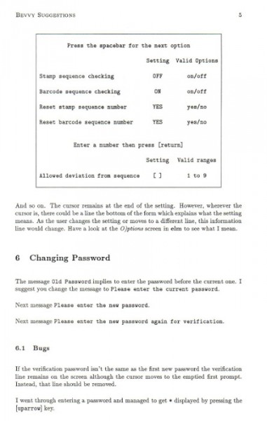
Here is an extract of the report to my manager:
There are too many colours in the system. Just because there are so many colours available it doesn' mean you have to use them all.
Try to be consistent with colours. Keep input prompts in the same colour, and all input, if different, in the same colour.
If you can't think of a reason why the interface is more usable by having such and such in a different colour, then don't make the thing in a different colour and use one of the different colours already on the screen.
I suggest not having more than four different colours on screen, including white.
