Health & Safety Publishing web site
Design, build and document a web site.
Limitless were recommended to SilverPlatter to build the Health & Safety Publishing (HSP) web site. HSP publish health and safety information and databases.
HSP wanted to promote and sell their products and include a health and safety magazine, based on Health & Safety World, an existing web site.
Paola worked with SilverPlatter to help define goals, content and functionality before building the 150-page web site. SilverPlatter would host and maintain the site themselves; online forms read data from CSV files, page templates, a written maintenance manual and style guide, and training.
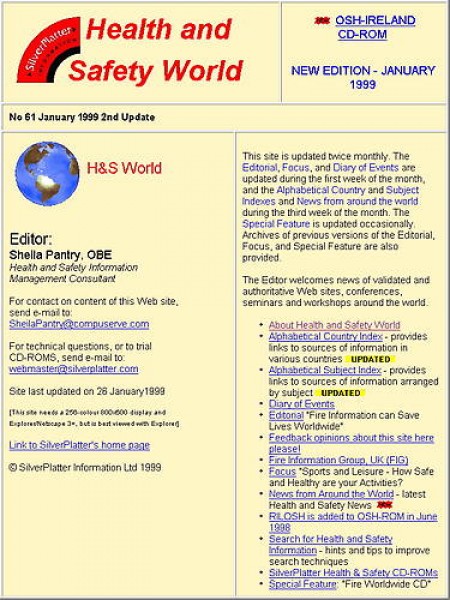
Health & Safety World

Paola reviewed the existing Health & Safety World magazine site which had been created and maintained by a Health & Safety Information Management Consultant and updated every fortnight.
The site contained about 70 web pages, mostly in newsletter or editorial format. The new site would re-use much of the content.
According to a recent WebTrends report, the top three entry pages were also the top three exit pages, each a very long page of links. Paola calculated that 80% of visitors to the existing magazine site accessed only one page per visit.
The report on "Most Active Countries" implied that most visitors came from the US; because of this report, SilverPlatter had intended to relocate, redesign and rewrite the new web site with this audience in mind.
Paola pointed out that the report couldn't be interpreted as the location of visitors. A WebTrends log analysis report says: The country of the visitor is determined by the suffix of their domain name. [It] is based on where the domain name of the visitor is registered."
According to the "Most Active Organizations" report, CompuServe was the most active organisation. However, CompuServe's customers anywhere in the world will appear in site logs with the domain compuserve.com meaning that, according to WebTrends' definition, they were all in the US.
Three of the top ten most active organisations were spiders; their accesses shouldn't contribute to decisions on the location and form of a new web site.
Planning workshop
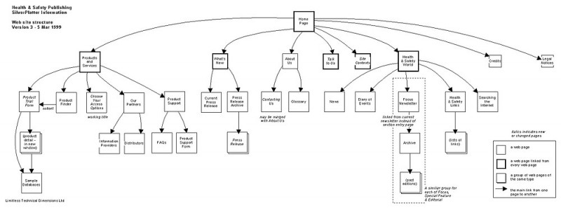
Paola started the project with a full-day workshop at SilverPlatter to discuss the site goals, visitor types, content and functionality. During the meeting, a site structure was sketched out - this was elaborated upon when she prepared the written requirements after the meeting.
Site content was split into two main sections - Products and Health & Safety World (HSW). The remaining pages were in a less prominent "site" section.
One of the three forms allowed visitors to provide product details to request technical support. SilverPlatter suggested that a copy of the message generated by web site was sent to the visitor as a reference copy. Paola thought that was such a good idea that we have applied this approach of a visitor copy of messages to all sites we've developed since then.
Graphic design
Paola asked Denison Design to develop the site's visual identity. SilverPlatter had just released a CD-ROM product with an updated HSP identity and wanted the style used on the site.
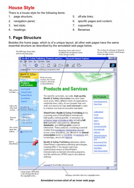
Denison devised a general sky blue theme and developed different imagery and colours to go on pages in each section: green for Products, blue for HSW and yellow for the general site pages.
Paola made the graphics web-ready, using colours from the "web-safe" palette, where appropriate, and optimised them for fast download.
Button states
Paola devised "selected" and "unselected" version of buttons and HTML link labels. The style of HTML links varied depending on the current depth in the site.
Sub-section links were implemented in HTML. On a sub-section page (level 3), the link would change to bold red text. On lower pages, the parent page would be linked again but remain bold red (using an HTML cheat).
Prototyping
 Paola created a project web site and posted page variations and content to it for SilverPlatter; new items were added to the top of a dated list. Nothing was ever removed from this area and so the archive served as a project history.
For example, before writing any software, Paola prototyped the web pages and mail messages that would be generated by the three online forms. An acknowledgement (success) and error (warning) web page was developed for each form, as well as the generated mail messages to SilverPlatter and the site visitor.
Content design
Once a house style had been established for site colours, Paola started applying it in the pages she had built with the existing HSW content and new content.
Various articles were regularly updated in the magazine part of the site. Paola developed a right-hand panel to include consistent links: to the previous article, to the article index and to the latest articles in other sections.
She tried out various colour combinations and then added the navigation to all the article pages in the magazine. Rather than just link to an article by date, the title of the previous article in the group was included in this article navigation panel.
Paola also tried out a table design for the product list that would appear on the product form.
The description of each product included a list of sources. She devised a presentation which listed all the standard database sources and then highlighted those used by the product.
Next is an example for two products. It was decided to go for a more condensed format instead.
| Product | CHEM-BANK | Sample this database | (O) Full Order (O) Free Trial | |||||||||||||||||||||||||
|---|---|---|---|---|---|---|---|---|---|---|---|---|---|---|---|---|---|---|---|---|---|---|---|---|---|---|---|---|
| Description | The quick brown fox jumped over the lazy dog. The quick brown fox jumped over the lazy dog. [more...] | |||||||||||||||||||||||||||
| Subjects | Chemicals; Emergency Response; Environment; Government Regulations; Hazardous Waste; Health & Safety; Science & Technology; Toxicology | |||||||||||||||||||||||||||
| Sources |
|
|||||||||||||||||||||||||||
| Frequency (months) |
|
Data Type |
Chemical Substances | Records | 150,000+ | Added Annually |
10,000+ | |||||||||||||||||||||
| Access Options |
|
Platform |
|
|||||||||||||||||||||||||
| Product | DOSE | Sample this database | (O) Full Order (O) Free Trial | |||||||||||||||||||||||||
|---|---|---|---|---|---|---|---|---|---|---|---|---|---|---|---|---|---|---|---|---|---|---|---|---|---|---|---|---|
| Description | The quick brown fox jumped over the lazy dog. The quick brown fox jumped over the lazy dog. [more...] | |||||||||||||||||||||||||||
| Subjects | Chemicals; Environment; Hazardous Waste; Health & Safety; Toxicology | |||||||||||||||||||||||||||
| Sources |
|
|||||||||||||||||||||||||||
| Frequency (months) |
|
Data Type |
Chemical Substances | Records | 4,000+ | Added Annually |
- | |||||||||||||||||||||
| Access Options |
|
Platform |
|
|||||||||||||||||||||||||
Site features
Paola designed and built an interactive Product Finder for the web site.
There were lots of ways to categories the Health & Safety products; SilverPlatter had fourteen products (e.g., DOSE and MSDS) arranged in three groups (e.g., Chemicals) and collating information from various sources (e.g., EINECS and HSDB). The products covered about thirty subject areas, such as Food Safety and Sport.
People could use the product list (form) to find specific products. However, if people were unfamiliar with the products or the information sources, visitors could search by subject areas. Paola created a form which listed checkboxes against the 28 subject areas (from Biotechnology to Water) plus options of database type and access method.
When the form was submitted, a version of the product list was displayed. Products were listed in the same style but products were listed in order of those matching the ticked requirements; those that matched the most requirements appeared at the top of the results list.
The Perl program which processed the form used a simple CSV file to match products to the ticked requirements. This meant that SilverPlatter could update, add or remove products from the Product Finder without ever having to change the program.
Likewise, the addresses that mail generated by the web site were sent to were also maintained as external text files.
The results page format following a site search was controlled by a Webinator configuration file. The file was based on the site house style.
Search results started with a message stating the number of results being displayed and the number found. The wording changed accordingly:
- One match: Showing the only match
- Two matches: Showing both matches, best match first
- Some listed: Showing matches 11 to 20 from a total of 37, best matches first
- All listed: Showing all 6 matches, best matches first
Sub-section (level 3) links were listed for each section as HTML links; SilverPlatter could then add level 3+ pages to the site without having to get any button graphics created.
To create extra space between links but normal gaps between links that might go over more than one line, Paola placed sub-section links in a table with cellpadding.
Many sites still just put a line break after each link - this means the gap between lines is the same for lines within links and between links.
The consequences of this are:
- it's often hard to tell where one link starts and another ends
- clicking on one link rather than another is much like a game of target practice.
Manual
 Paola created a project web site and posted page variations and content to it for SilverPlatter; new items were added to the top of a dated list. Nothing was ever removed from this area and so the archive served as a project history.
The Health & Safety Publishing group were to host and maintain the site themselves. Paola drafted a maintenance manual and then refined it after spending a day watching SilverPlatter perform routine tasks.
The resulting 92-page manual documented the house style in terms of graphic design, content design and a writing guide.
Most of the manual was devoted to giving step-by-step examples on how to make common changes (such as adding a press release), to more complex changes such as adding a new product, and large structural changes such as adding a major section to the site.
For each of the common maintenance tasks, fragments of HTML were given with the elements that should be shown marked in red.
As a testimony to the success of the manual, SilverPlatter successfully added a new product to the site (including to the Product Finder) within a month of the site being launched without the need of any help from Paola.
The web site was regularly updated by SilverPlatter for three years when it was decided that the main SilverPlatter web site would handle the Health & Safety Group's products.
