Redesign of OED Online Help
Redesign the help pages for OED Online to improve the user interface.
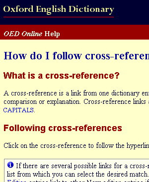
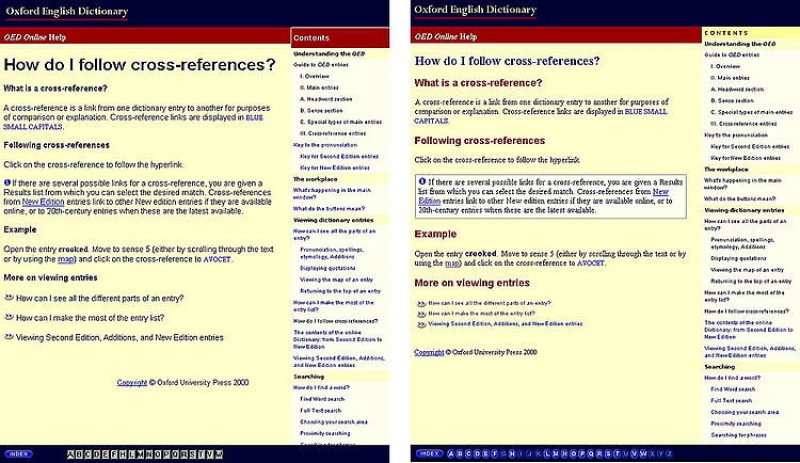
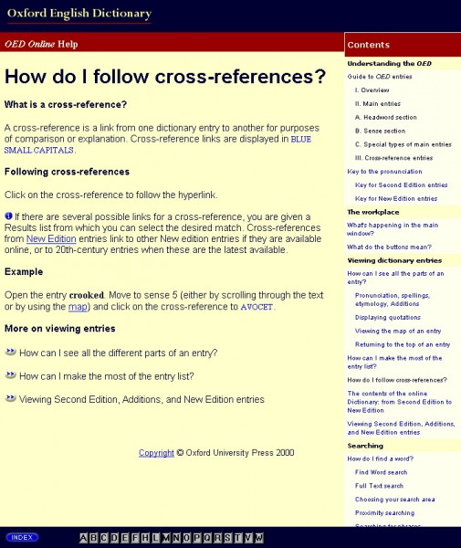
As part of the beta review of OED Online, Paola noted that the Help pages were neither in the same style, nor of the same quality, as the rest of the web site.
 She made a number of suggestions and illustrated them with a couple of mocked-up pages; OUP then asked her to apply most of our suggestions to the 43-page help system.
Frames
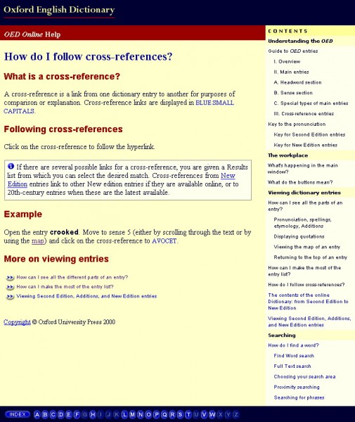
The original version of the Help pages supporting OED Online did not make use of frames, even though OED Online itself did. Paola converted the 45 Help pages to a frame-based format; she set frames up in the same proportions as the main web site and adopted the right-hand index style of the Tour for the Help Contents.
Standard style
Paola adopted the style of page heading from the Tour to Help. After applying the rest of the existing house style to pages, she created a consistent style for key page elements, such as headings, information panels, and lists of links to related Help pages, while maintaining the brand colours of yellow, red, green and blue. Text style was implemented in CSS and an external stylesheet.
The Help Contents were moved to a permanent frame on the right-hand side and the A-Z Help Index was available in the bottom frame.
A-Z index
The original A-Z index had gaps in. Paola felt that the index should include the whole alphabet and show letters in an "unclickable" style if there weren't any relevant pages.


The new approach maximised access to the Help Contents and Index whilst making the system easier to maintain because of the use of frames and CSS with the external stylesheet.
Paola provided a template to use when creating new Help pages.


