WHM web site
Design, build, maintain and refresh a web site for a charity.
Paola was wholly responsible for the design, construction and maintenance of the web site for the Windsor Half Marathon (WHM - formerly the Building Industry Windsor Half Marathon) for five years from 1996. Her time was provided pro bono.
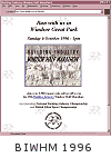
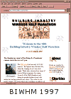
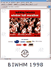
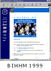
The half marathon is an annual event in Windsor Great Park with around 5,000 runners.
The event has building industry links and raises money for charity (over £1,000,000 at 2001).
Background
The original Race Director of the Windsor Half Marathon did not have access to the web; Paola took responsibility of the site structure, design and content.
The site was originally based on the 4-page entry booklet (entry details and forms) and, after the event, expanded to include the souvenir results booklet event (with results, photos, and organiser's report).
The basic grouping of this year's event (entry booklet) and detail on past events (results booklet) determined the structure of the site.
The design of the events printed materials changed every year and so did the web site design.
Entrants mailed with event reports which were then added to the site with the author's permission; event reports became a regular feature and exclusive to the web site.
2001 home page
Thumbnails
The WHM web site was the vehicle with which Paola learnt about making the thumbnails and photo images. All photos included captions, even the 100x100 pixel thumbnails.
At first, Paola made thumbnails to include as much as possible of the original picture but, at the small size, the resulting thumbnails were too complex.
Paola later improved on this approach by basing thumbnails on a zoomed area of interest in the larger photos. This meant that the thumbnail itself was useful whilst linking to a larger photo of a larger area.
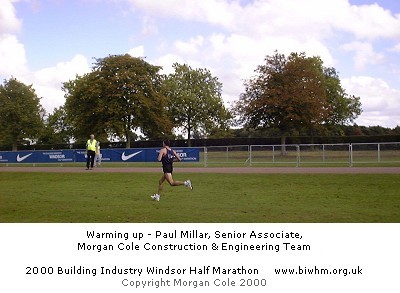
The site contained hundreds of photos in the event archive. Paola added information at the bottom of the large photos so that a) they'd make sense when seen out of context, for instance, on a search engine and b) to discourage images being copied.
The information included at the bottom of photos included:
- a longer caption
- the site name
- the web site address
- a photo credit
Thumbnail
Full photo
Navigation design
Site navigation was arranged horizontally across the top of pages. It was duplicated at the bottom of long pages in its entirety; that is, links appeared in the same graphical (and cached) form rather than appearing like a different set of links.
As a result of a discussion on the CHI-WEB mailing list about graphical vs. text links, someone posted a request for examples of good graphical links on CHI-WEB.
Buttons with link colour borders
The criteria were (quoting from Joe Grant's post):
- clearly convey they are indeed links (not just images)
- clearly convey that they have not yet been visited
- clearly convey that they have have been visited
- do not require rollovers or other mouse action to be understood to do the first 3 criteria
Joe said that "icing on the cake would include":
- clearly convey some kind of hierarchy, priority, or relevance to the particular content of the page
- convey some kind of hierarchy or priority across the site or sub-site
Paola converted the graphical buttons on the WHM web site to use HTML borders. That is, the borders of the buttons was achieved by BORDER="1" in the IMG tag.
There were two rows of three buttons on the WHM site. The top row were designed to be more prominent by including a photographic element. The photo element and part of the button text was colour-coded (the ubiquitous red, green and blue).
The second row on buttons were were general site pages, such as site contents. The three buttons on the second row were in the same style. The main button graphics were 3D in that they were in a embossed (unselected) and inset coloured (selected) style.
Logo and navigation at the top of pages
Graphs
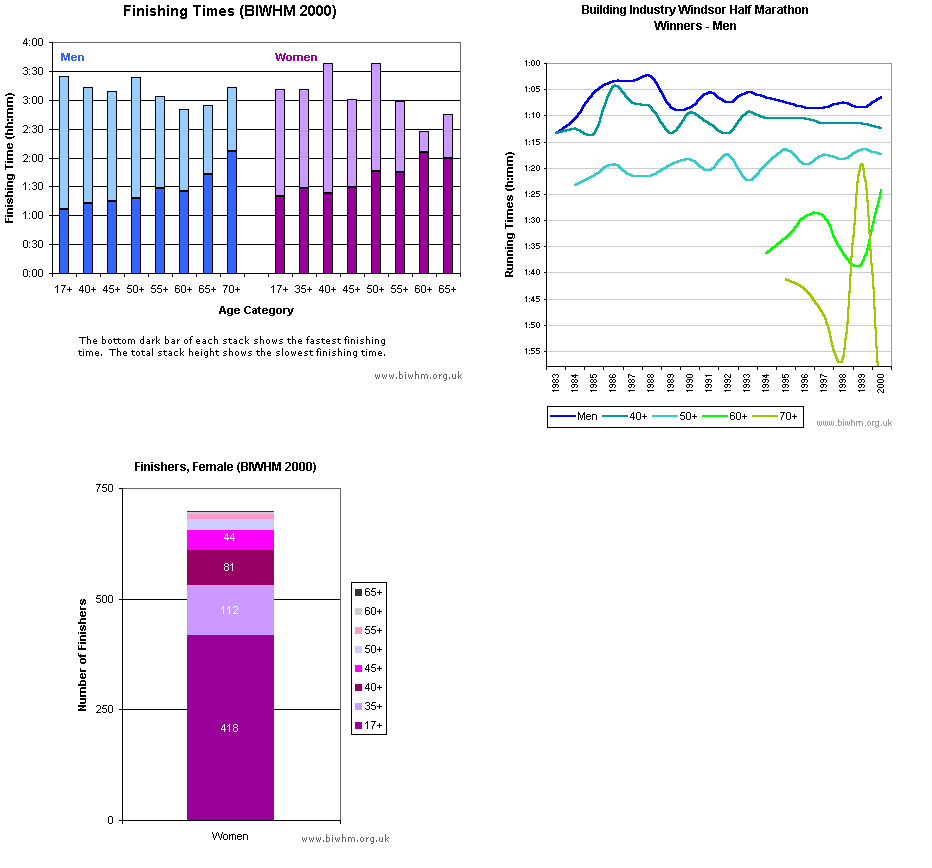
Every year, Paola created graphs for the web site using the running times results.
Paola maintained and refreshed the site design for five years.