oed.com web site redesign
Restructure and redesign oed.com.
In early 2003, Oxford University Press (OUP) asked Paola to help reorganise, redesign and redevelop the public area of oed.com, the web site for the Oxford English Dictionary (OED).
She had helped design and build the original OED marketing site six year earlier, which had been maintained and extended by OUP.
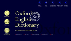
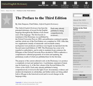
Original home page
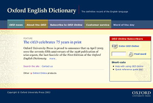
Redesigned home page
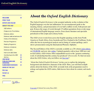
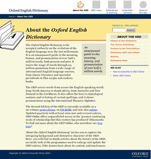
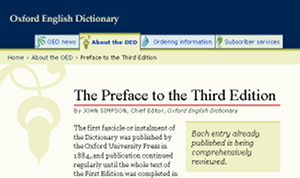
Original About page
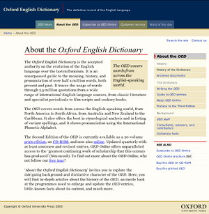
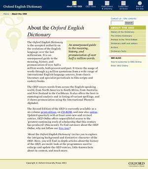
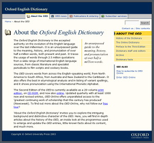
Redesigned About page
Purpose of the redesign
The original site was developed when Netscape 3 and IE 3 were commonly used; the standard at the time was HTML 3.2 and CSS wasn't available. In addition, the site's main colours were limited to the browser-safe palette because most people had 8-bit displays in 1997.
The site was first launched with less than 50 web pages and has been maintained by Oxford University Press since then. By 2003, the site had grown to nearly 370 web pages, and much of the new content was buried deep in the site.
OUP had replaced the section buttons with text links in side navigation. The addition of a dynamic JavaScript menu to list lower links posed some accessibility problems.
Features of the redesign
- The site has been completely reorganised and extended, resulting in nearly 600 pages in four content sections.
- A dynamic home page allows authenticated OED Online subscribers—the subscription service to the online dictionary—to start searching the dictionary. A sign-in form appears for non-authenticated visitors.
- Each content section, plus the general site pages, has been assigned a distinctive hue, which has been applied to section-specific elements on pages.
- Navigation has been split into global and local navigation, plus links to related pages elsewhere on the site. In addition, context links (breadcrumbs) on every page show the shortest path to the home page.
- Links to the home page, the four main content sections and the Word of the Day (part of OED Online) are available at the top of every web page and are displayed quickly.
- Local navigation is on the right of the page, giving priority to the content.
- To keep the local navigation simple within the large number of pages, the current page is shown in the context of its parent page rather than in that of the current section.
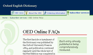
- The OED Online tour originally created using frames, has been converted to the new design without frames.
- The site uses relative font sizes and percentage widths to achieve a liquid layout.
- Some especially large web pages are sub-divided, and given their own linear navigation, to make them more usable.
- External style sheets are used for presentation. They make use of advanced CSS features, and yet the site still worked and looked acceptable in Netscape 4, notorious for its poor implementation of CSS.
- An additional print style sheet hides web site navigation from print-outs.
- The site is built and maintained from structured page data, HTML templates and separate content files. Consequently, the site structure can be revised just by editing the page data.
Reorganise content
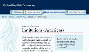
An inner page with right-hand navigation
Paola ran a one-day workshop at OUP to reorganise the site structure. To do this, she created a representation of the existing site structure, using coloured sticky notes on several sheets of A1 paper.
With the sheets attached to the walls of the meeting room, we discussed the problems with the existing structure and the requirements of the new structure. Paola built a new structure on blank sheets of paper by moving the sticky notes around.
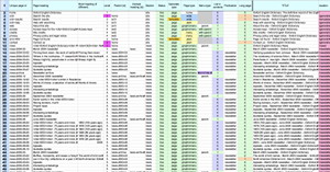
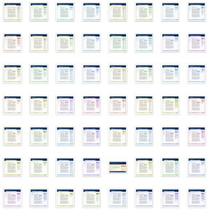
The result was photographed and converted to a spreadsheet and a 2D diagram to capture the new site structure. As the structure was refined throughout the project, the spreadsheet was updated.
Using tools we developed, the same spreadsheet was later used to generate the web site.
Spreadsheet defining all pages
Page layout
Paola specified that each major site section should be identified by a colour and icon which would be applied to elements in pages for way-finding.
She worked with OUP to decide what common elements should exist on each web page, where they should be placed, and with what prominence.
To define the page layout, she compiled a list of page elements with 0UP, such as links to the main content sections, a copyright notice and pull-quotes. Paola then created prototype page layouts with different combinations of elements. Using feedback and suggestions from OUP, these were developed and refined until a page layout was agreed.
The page layout was incorporated into the requirements document, and a colourless prototype page was created. Paola then used the requirements document to write a design brief for her chosen graphic designer, Francois Jordaan.
Colourless page layout
Design routes
The designer developed three design routes. Paola applied each design to three pages within the site. She created a set of pages using the same section colour, so that colour would not be the deciding factor between the routes.
The design routes were presented to the OUP project team and to key OED staff, including the chief editor of the OED. One route, with the addition of tab-style navigation from another route, was a clear favourite.
Through iteration, we reached a design for the home page and inner pages that OUP were happy with, and that fulfilled the key original requirements.
Route 1 by Francois Jordaan
Route 2 by Francois Jordaan
Route 3 by Francois Jordaan
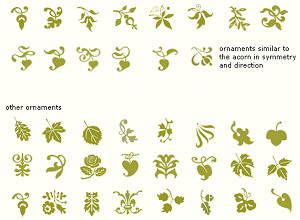
We picked the route with the typographic ornaments as that spoke to the age and tradition of the dictionary.
Paola and Francois collated ornaments to create their short-list.
With the final four picked, Francois tried many options for the main navigation, exploring buttons or tabs with and without the icons in different states.
Short list of ornaments
Using Francois's final page designs, Paola tried out variations of colours for the different sections.
Colour trials
These were the final colour and graphic choices for the four main site sections.
News section page
About section page
Ordering Information section page
Subscriber Services section page
Home page design
The design of the home page was as extensive as it was for inner pages.
After deciding what the home page should include, Francois first wireframed many options. Once OUP chose their favourite, Francois then mocked-up many variations of the tabs and the main decorative graphic.
Tidying up
OUP added and reworked some of the content on the web site. Paola reformatted the pages and some of the pages: she added a detailed listing of pages on the combined site search and site contents page, and also applied consistent styles to content elements, such as lists of featured links, off-site links and lists of links to headings on certain pages.
A few weeks before going live, a senior US manager asked for the typographic ornaments to be removed. Paola and Francois updated the files acordingly.
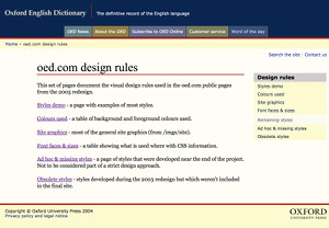
Style guide
Paola wrote a web-based style guide for the site, documenting issues such as typography, CSS styles and graphics.
Style guide


