OED Online redesign
Update the visual design and improve usability of OED Online.
Following the success of her redesign of the public pages at the Oxford English Dictionary (OED) web site, Oxford University Press hired Paola to apply the design to OED Online.
Original design (2000)

New design (2005)

Paola was briefed to make only the minimum of mark-up changes to apply the new design, effectively making this a re-skinning project for the dictionary. This created an interesting challenge as it meant that she could not add or remove frames, move elements within frames or change the names, positions or sizes of the graphics, except in certain limited cases to improve usability.
Paola used the same graphic designer we worked with on the public pages redesign. Many of the elements in OED Online did not exist in the public site so she designed them from scratch with the graphic designer. The new design was implemented by HighWire Press using the new graphics, new style sheets, templates and documentation.
Background
The Oxford English Dictionary (OED) is the world's foremost scholarly resource on the English language, and chronicles the development of the language from earliest times until the present day; it is much more than just a way to find out the meaning of a word.
Its web-based incarnation, OED Online, was launched in March 2000 and designed by OUP with Denison Design Ltd. It was a framed site made to work with at least Netscape Navigator 3 and Internet Explorer 4 at 640x480 screen resolution. The web-safe palette was used for the colour scheme and graphical buttons; typography was limited to Times Roman and Arial.
As part of this redesign, Paola created a colourway based on one of the page types in the public site, she updated typography, developed a consistent and coherent button design and made usability improvements.
In addition to design and development expertise, Paola also provided appropriate analytical and operational support to the project.
Project stages
Paola defined these stages for this project according to our systematic methodology that minimises rework and promotes project progress:
Design
- Analyse browser stats (4-page report)
- Define design & technical approach
- Document public site design
- Document OED Online page types
- Classify OED Online buttons
- Present entry colourways (3)
- Button design routes (4)
- Present colourways for OED-2 entries
- Entrance page design
- Create mock-ups for all page types
Development
- Create button graphics (120)
- Create web pages for each page type (40)
- Test web pages on different browsers/platforms
- Create HTML templates
- Document mark-up changes (57-page manual)
- Convert character GIFs (1,000)
- Test & retest HighWire's design implementation
- Recreate OED Online Help graphics (75)
- Recreate OED Online Tour graphics (60)
Preliminary analysis
Paola found 1,000 visits a week by users of Netscape 4.7. This confirmed the need to accommodate such older browsers rather than exclude them completely from the design. She also discovered that JavaScript use varied significantly over weekends and holidays, suggesting significantly different browsers were being used at home and work.
To provide a basis for the design process, Paola felt it was necessary to understand the technical constraints on OED Online's existing users. To do this, she analysed the site logs.
The results of this analysis complemented the design principles we established with OUP for the project, and helped to drive the design process forward in an informed and rational way.
JavaScript use over a holiday: different browsers for home and work

Online collaboration
In order to improve communication between the project's geographically-dispersed participants, Paola set up and ran a restricted-access web site for the project that all team members could access and modify for the duration of the project.
She also created fully-marked up versions of pages for all 43 page types and variations, and accompanying downloadable text templates, to make implementing and testing the new design as straightforward as possible.
Paola understood the nature of the changes that HighWire, the site's implementors, would have to make to implement the new design. She created detailed documentation for the needed revisions, consisting of frame-by-frame lists of changes, additions and deletions to the existing site's mark-up.
Project wiki home page

Handover documentation
As a programmer herself, Paola understood the nature of the changes that HighWire, the site's implementors, would have to make to implement the new design. She created detailed documentation for the needed revisions, consisting of frame-by-frame lists of changes, additions and deletions to the existing site's mark-up.
Paola also created fully-marked up versions of pages for all 43 page types and variations, and accompanying downloadable text templates, to make implementing and testing the new design as straightforward as possible.
Example mark-up documenation

List of marked-up pages

The redesign features many usability and design enhancements. Below are just a few.
Dictionary entries
The original design was constrained to web-safe colours; these resulted in strong yellows. The redesign uses softer yellows, and uses different tints to section off areas of the page, such as the side frame from the rest of the entry.
Paola applied the public site design style of Georgia for the main text, Times Roman for page headings and Verdana for small text. In addition, quotations are a different colour, are indented, and have a softly-tinted background.
OED Online is effectively two publications: OED-2, as published in 1989; and the latest versions of entries. OED-2 entries can be searched and browsed separately from the most up-to-date versions. To emphasise the difference, current dictionary entries are in yellows, while OED-2 entries are in blues. OUP wanted to retain the Times Roman font for OED-2 entries, and there is no background tint behind quotations in these version of entries.
Original dictionary entry design

New dictionary entry design

Second Edition set
OED Online is effectively two publications: OED-2, as published in 1989; and the latest versions of entries. OED-2 entries can be searched and browsed separately from the most up-to-date versions. To emphasise the difference, current dictionary entries are in yellows, while OED-2 entries are in blues. OUP wanted to retain the Times Roman font for OED-2 entries, and there is no background tint behind quotations in these version of entries.
Original OED-2 entry design

New OED-2 entry design

Entry map
Paola added soft grey vertical lines to the empty cells in the entry map so that elements within the same column were more strongly grouped visually.
Original

Redesign

Entry and results navigation
Due to technical constraints on OED Online, one set of button graphics had to work on two colours of pages: yellows and blues. To achieve this, Paola did not anti-alias the button edges.
In one special case, Paola made a flat semi-transparent graphic to be used as a label. The page background colour shows through and makes the graphic blend in on both backgrounds.
Original


Redesign


Close-up


Footer tabs
The footer is the same yellow colour as the header in the redesign. This allows for lighter buttons in the footer. The redesigned buttons use the same white on red for selected+unclickable tabs. However, it uses the new standard button style for the remaining clickable buttons (blue on dark yellow). Together with the sentence case labels, the buttons now look clear and calm.
Original

Redesign

These footer tabs were originally three-state buttons in that there was a greyed-out unclickable version. These appeared on page types on which the buttons could never be clickable. Paola adopted the design rule that such buttons would never be displayed, rather than always be shown greyed out.
She kept with the blue and red to denote whether a button was selected in these two-state entry toggles. Paola created a pushed-in style to distinguish it from unclickable selected tabs.
Original

Redesign

Entry toggles
Paola kept with the blue and red to denote whether a button was selected in these two-state entry toggles. She created a pushed-in style to distinguish it from unclickable selected tabs.
Original

Redesign

Print version of entries
The (Print) button on entries displays an unframed page suitable for printing.
Paola improved the header by de-emphasising the copyright notice in the page heading. She also added red lines at the start and end of the entry.
These print versions use a single style sheet suitable for both screen and print.
Original

Redesign

Top frame buttons
There had been some confusion by visitors on whether the (Lost for words) button in the top frame was associated with the input box. In fact, it displays a random entry.
Paola explored and presented various options, including using the new submit button style for the (Find Word) button. The chosen design was to move the (Lost for Words) button to the left of the input box. In addition, she tinted the (Find Word) button green on OED-2 pages to denote the change in the scope of the search.
 Original
 Redesign
 Redesign OED-2
Simple search
Paola made a number of small changes on the Simple Search form to improve usability:
- moved down the "for" and "in" labels next to the input fields they are associated with
- added label tags to the radio button labels to make them clickable
- applied a distinct button style to the 'search' form button
- changed the 'Fewer option' and 'More options' toggle graphics to look like HTML links to make them distinct from the search button
- put the search button last (although it is declared first in the HTML so that the visitor can initiate a search by pressing the Return key)
Original

Redesign

Advanced search form
Paola made a number of usability improvements to the Advanced Search form during the redesign. They are explained after these overview screenshots.
Original

Redesign

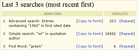
Advanced search form, recent searches
Up to ten recent searches are summarised at the bottom of the Advanced Search form.
The summary contains links which allow a visitor to:
- repopulate the relevant form with the search inputs, or
- rerun the search.
In the original design, the two links were presented within a sentence.
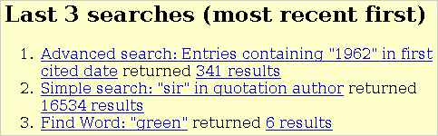
Paola converted the information to a table with column headings in the redesign. The first two 'searches' columns include the search name and the link to repopulate the search form. The last two 'results' columns include the number of results and a link to repeat the search.
Advanced search form buttons
She adopted a general design rule that form submit and reset buttons would have their own style. (The (Find Word) button in the top frame is the exception.) She made the reset button less prominent by making it grey.
Finally, Paola changed the display order of buttons whilst declaring the 'search' button first in HTML so that visitors could still press Return to initiate a search
Original

Redesign

Advanced search form options panel
Paola made two improvements to the options panel on the advanced search form:
- labelled each sub-panel by putting key words in bold.
- added label tags to the radio button and checkbox labels to make them clickable.
Original

Redesign

Full text results
Paola made a number of usability improvements to the results pages. They are explained after these overview screenshots.
Original

Redesign

Results header
Paola introduced a new design rule for the project that all pages will have a page heading (in the darker yellow band). She thought that the word 'Results' alone was clearer than the number of results displayed. Paola moved these result numbers to the left of the control that determines how many results are displayed per page.
She added a summary of the search above the results table, reworded 'List by' to the more common 'Sort by' and she added column headings to the results table.
Original design

Redesign

Results list tabs
One of the problems with the original button design was that the red and blue buttons were equally prominent. In the redesign, Paola made the three tab button states - clickable, unclickable and selected - more distinct.
 Original
 Redsign
Results list navigation
At the bottom of the results pages, there are linear navigation controls when there are more results than are being displayed. In the original design, the previous/next buttons were in the same style as the form submit button ('More beginning at'). Paola applied the new house style for form submit buttons to it to show the difference in behaviour.
 Original
 Redesign
Print version of results
The (Print) button on results lists and entries displays an unframed page suitable for printing. Paola improved the header by de-emphasising the copyright notice in the page heading. She added column headings in the same style as the non-print pages. She also added red lines at the start and end of the results. These print versions use a single style sheet suitable for both screen and print.
Original

Redesign

The redesigned OED Online was launched in September 2005.


