Refactor a user interface
Reduce variation in the user interface of a large web site.
Overview
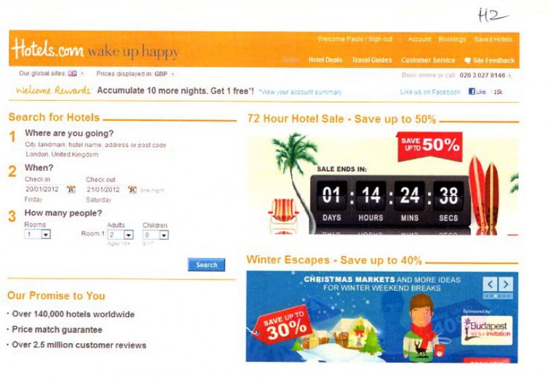
Originally hired to audit and document the hotels.com user interface, Paola identified the business need to improve efficiency: the ever-expanding user interface was slowing down the design and development of new features intended to increase conversion.

- planned and managed the company’s first site-wide project
- enlisted the help of people across the company to ensure a good outcome, from designers and developers to software managers and VPs
- created a paper audit of hotels.com - I then identified and categorised 30 user interface elements using a customer-centred approach
- ran reduction sessions with 25 UX designers, visual designers and front-end developers for each user interface category to choose the best version or to sketch another (e. g., 23 hotel summary variations reduced to one flexible version)
- proactively aligned my project with a software refactoring project going on at the same time
- successfully pitched the business case of a reduced user interface to all five Product Managers and the VP of Product
- created a documentation framework for the reduced user interface
Database
Paola was hired to design and build a database that would document the user interface of hotels.com.
The user interface is everything the user sees or interacts with.
She was hired as an Information Architect with software experience and sat within the User Experience department, next to the Visual Designers.
The web site was designed and built by 20-30 designers and developers. The site site was constantly changing as Product Managers tried changes within multi-variate tests to increase bookings.
Paola wrote some questions one could ask of such data and hung them by her desk to prompt conversation. Some people added additional questions.
Questions that can be answered by a UI database
Interviews
Paola arranged interviews with the kinds of people who would use a database of user interface elements. She had meetings with developers and a few user experience designers.
She found out that the developers were in the process of refactoring the code which had become sprawling over time. Paola realised that the developers and designers were spending a lot of time hunting down knowledge about specific user interface elements which had a lot of variation because it had never been documented.
A sprawling user interface
Paola decided that the better use of her time was to audit, review and reduce unneccessary variation in the user interface, rather than document something that was harder and harder to use for the designers, developers and the site visitors.
User research & company meetings
During her contract, Paola observed user research sessions that were happening at the time.
She also and attended a presentation by a company who had done qualititaive research by talking to people in their homes about how they shopped for and booked hotels. She met and talked to the five Product Managers at these sessions.
Paola also went attended departmental meetings and any division meetings. It was useful to see what the issues were and how people interacted. This proved useful when she later talked to people in different departments about their work that would be affected by her project.
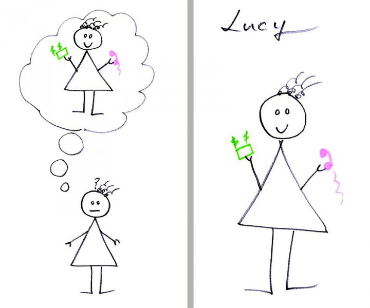
Lucy
When meeting with the User Experience Designers, Visual Designers and developers, Paola introduced Lucy, a representative customer.
When people are shopping for a product, they first look at many options, compare them using whatever criteria are important to them and make a short-list. This activity was borne out by the ethnographic research.
Research-mode Lucy doesn't yet know what she wants to spend her money on, nor whom she should trust with it. She's just looking for evidence that, if she buys with a company, it will be money well spent.
She is imagining a time in the future when, card in hand, she can book a hotel with confidence that it provides the best value for money for her budget, be it £50, £200 or £1,000.
Lucy, our customer, is either researching or intends to order
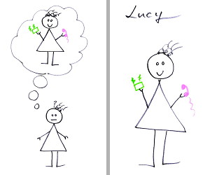
Order-mode Lucy has done her research and is now ready to buy. She won't be browsing but will go directly to what she wants.
Research-mode Lucy will spend more time using the site than Order-mode Lucy.
Every little problem erodes confidence; if I can't trust you to display information on a web page correctly, why should I trust you to give me reliable information, protect my credit card details, or deliver my holiday dreams?
Lucy has no inside knowledge of the company set-up.
- she doesn't know, or care, how or why the site is the way it is;
- she doesn't know that we outsource parts of the site to third parties;
- she just knows that pages with the 'Hotels.com' header are hotels.com, and she has the reasonable expectation that things look and behave the same from page to page, which is where we come in.
Both Lucys would be served by this project.
Audit
Paola enlisted the help of the UX Manager and Lead UX for audit the web site systematically.
We divided the site up between us so that we would cover the whole UK site between us. Paola specified that we list each variation of a page in the company intranet, writing down how to reproduce that page.
Page variations are about page layout and style, not about content.
For example, a form has three states:
- default form
- form with error messages
- form after successful completion
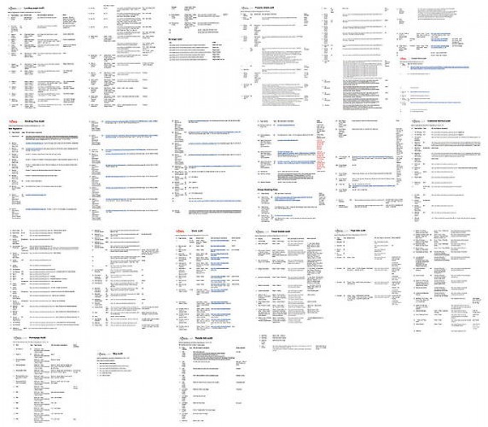
Pages listing every page type and how to reproduce
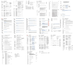
Paola also audited the mailed messages that went to visitors and customers.
The audit looked at the site as a whole, irrespective of how it came about, because that's how customers see it.
In all, 380 distinct page types were found.
Print-outs
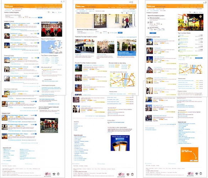
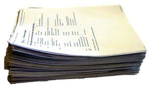
Once the audit was complete, Paola used the page lists to print out every page type twice.
The first copy set was used to refer to in discussions.
For a site that was essential a search engine (search form, results list, detail page), there were a lot of page variations.
Print-outs of every page type
UI elements
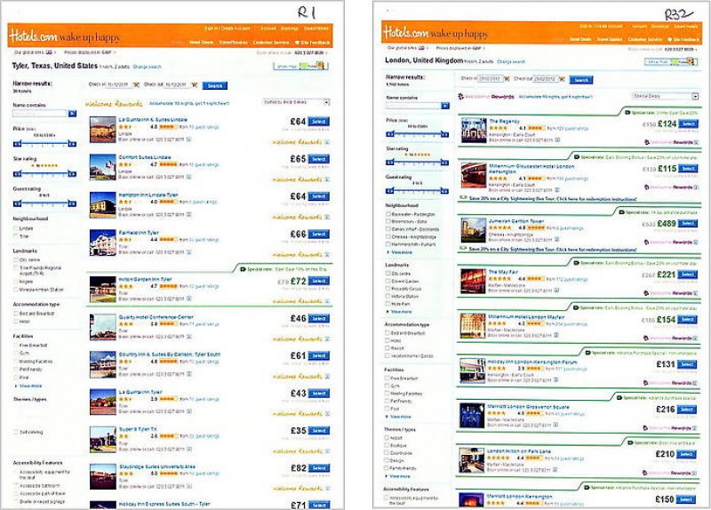
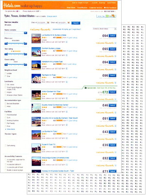
Paola assigned a unique id to every page variation (using the section and a sequential number), such as R1 for the first results list in the audit.
On the back of the second set of print-outs, Paola printed the id on the back.
This meant that when the user interface element was cut out, you could see where it came from.
A second copy of the printouts with unique code on the reverse
Page elements
Paola decided to look for variation from the customer's point of view, rather than the designer's or developer's, because the customer is the constant; theirs is the only point of view that can create a significantly better customer experience.
The project looked at the site as a whole, irrespective of how came about, because that's how customers see it.
Initially, Paola wanted to work with the designers and developers in small sessions to identify those page elements that should be reviewed and standardised.
However, the first session was challenging and so Paola identified them herself:
Some of the different page elements
- Header
- Footer
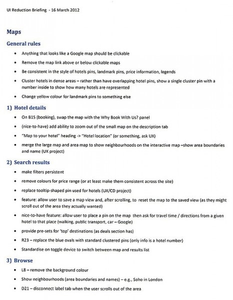
- Maps
- Price colour
- Hotel summaries
- Booking detail
- Forms in general
- Search forms
- Messaging (error, ack, system problem, info)
- Info panels
- Expand / collapse
- Icons
- Use of colour
- Urgency / popular
- Close device on pop-up windows
- Toggles
- Photos
- Hotel thumbnails
- General content style
- Buttons
- Cancel
- Links: go back
- Links: go prev/next
- Links: see all/more
- Lists of links
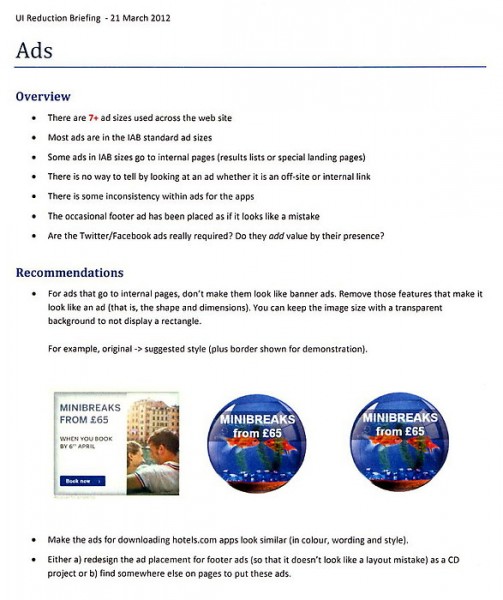
- Adverts
- Welcome Rewards
- Booking flow
- E-mailed messages
- Property detail page
- Travel guides (index, country overview, city detail)
Search forms
Paola went through the second set of print-outs and cut out the page elements she had identified.
The cut-outs were marked with a unique id on the back so that one could identify its source.
Paola then grouped like elements together, for example search forms, storing them in large labelled envelopes.
For the presentation at the end of her contract, Paola stapled the elements of each type onto A1 sheets of paper.
32 search form variations
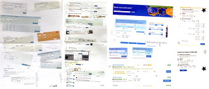
Paola found 32 variations of the search form. The variations were in label wording, position and style, what fields were present, size and position of the search form on the page.
This meant that, if a Product Manager asked for the submit button to be made bigger, the designers and developers would have to know a) that there was more than one search form type, b) which one the PM meant and c) how to find the code for it.
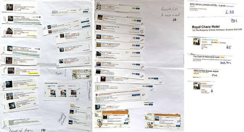
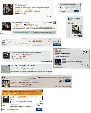
Hotel summaries
Paola found 27 variations of hotel summaries.
They varied by what information was in it, its style and position.
For a visitor to the site, this would cause a lot of confusion because they would have to re-interpret the information each time; there were no standard rules for information display to aid readability.
27 variations of hotel summaries
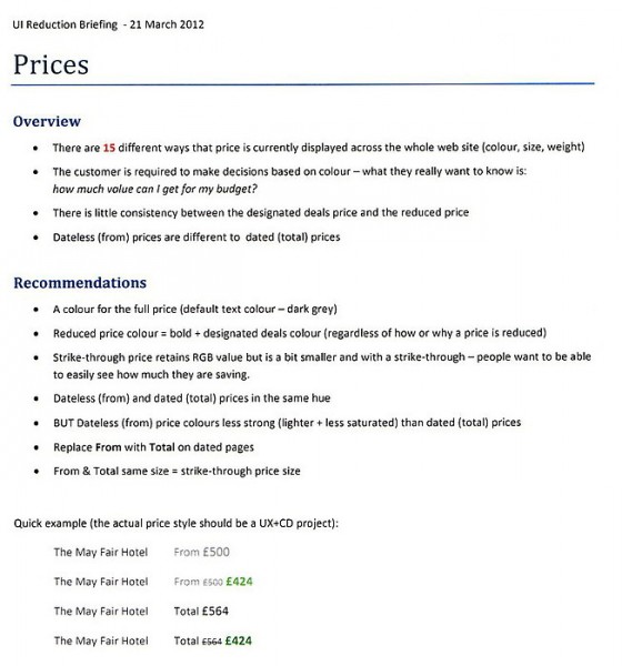
Prices
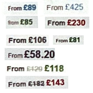
There are two sets of prices in hotels.com - one where the site doesn't know when you want to travel (it shows From prices), the other where it knows your dates and can give you actual prices.
In addition, sometimes a rate is reduced. The original (higher) price is shown strike-through with the reduced price next to it.
Paola found variations in wording, size and colour for prices. This, again, causes confusion for visitors, but also slows down changes on the site.
Some of the 16 variations to display prices
Reduction sessions
Once the variations of page elements were grouped as paper cut-outs, Paola organised sessions with two other staff members - UX, visual designers and developers. She wanted to hear their input bu also for existing staff to have a say in and be invested in the result.
Format
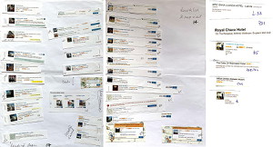
The refactoring sessions started by spreading out the print-outs of the page element on a table and seeing if one already stood out as the variant to replace the others.
We discussed the pros and cons of the variations and came to a consensus. Paola placed a gold star if a variant was good enough. If a variant was okay but needed tweaks, Paola added a blue star next to it.
Paola ran a session like this for the 30 page elements. In some sessions, we tackled more than one.
Hotel summary variations
Guardians
The Lead UX Designer attended many of the sessions.
We decided that each user interface area should have a Guardian, a term we came up with, who would have ownership of it, with regard to over-seeing the design and documenting it. We invited the Product Managers to attend and be Guardians too.
People who attended the sessions said later that they enjoyed them and had found them useful.
Prototyping
The UX department had been using Axure for prototyping. Paola had noticed that they were highly-finished when presented to teh Product Managers.
She and the Lead UX Designer decided to present sketches. It was quicker to iterate designs and, when presented to managers, they started a conversation rather than seeming the final design.
Paola initially sketched on A4 paper and then transferred final versions onto A3.
For the search form, 32 variations were reduced to 2. A bigger form for the home page and a strip for all inner pages that would sit between the top header and the page heading.
Sketches of the search form for the home page
Sketches of the search form on inner pages between the page header and main heading
Hotel summaries
Hotel summaries were the hardest element to sketch because it contained so many elements.
Paola settled on a format where factual information about a hotel (name, location, photo) was on the left-hand side.
Sketch of a hotel summary
Forms
There were a lot of forms on the site.
Paola sketched two versions. One default version to show the position of labels, and the difference in prominence between Cancel and Submit.
The other version showed the error state.
Sketches of form labels in default and error state
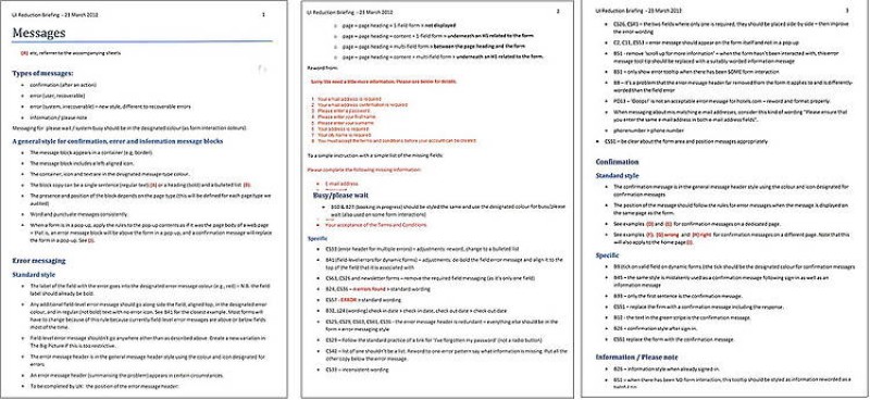
Messages
Temporary messages often apeared on the site.
Paola's sketches showed where they would appear and be contained somehow.
A message would always be displayed under the page heading, be associated with an icon and might have a heading.
Sketches of message boxes showing position and style
Prices
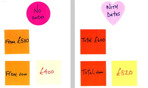
Depending on whether a visitor has entered their travel dates on hotels.com, the site displays two kinds of prices: From prices or actual prices.
In addition, sometimes a rate is reduced. It is shown with a strike-through with the reduced price next to it.
Paola used coloured post-it notes to demonstrate the 2 x 2 variations needed to style.
Prices with minimum variations
Documenation
In preparation for a meeting to all the Product Managers, Paola wrote notes for various page elements, such as prices and how adverts were used.
She also stapled the cut-outs of hotel summaries and search forms to large sheets of paper because they were the best refelection of the amount of variation in the site's user interface.
Design recommendations
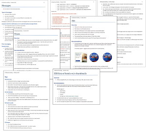
Presentation text
Introduction
Anything that slows down development, or that increases the cost or complexity of making changes to the site, is a drag on the entire business.
Partly as a result of our rapid expansion, we now find ourselves suffering under a heavy, and increasing, burden, one that affects all the user-experience designers, creative designers and developers.
Every time they start work on a new task or project, they have to discover what must be added or changed, which is actually a huge amount of work, because the site is enormous and growing, and there is no master library for the site.
Presentation to the Product Managers

This burden is magnified for new staff or contractors; there is no useful documentation that allows people to just look up what they need to know to get started on their work.
Consequently, because the code is so complicated, the developers routinely copy code for an existing feature in order to amend it, creating a new variation.
This copying has created, and continues to expand, a huge amount of technical debt which doesn't need to exist, but which the business is paying the cost of servicing every single day.
This debt is spread across all PODs (teams), and is a widespread and growing problem.
Goal
The goal of my work has been to reduce unnecessary variation in the web app's user interface, in order to:
- reduce the time and effort needed to change the site
- make the user's experience of our sites slicker and reduce bounce
Last December, in order to discover the scale of the problem, we audited the site to capture information on how many variations of search form there are.
As a result, for the first time, we now know how many variations there are, at least for the UK site.
Can you guess how many that is?
25 (show the variations)
Problem
The burden of this variation is not theoretical...
Kate is a designer who was tasked with adding the TripAdvisor rating to the hotel summaries shown in search results. Ideally, she would make this change in just one place.
Unfortunately for Kate, there isn't one place to go to change this. There are even just 25 places to go -- there are 27 variations of hotel summary across the site.
Kate ended up having to change 14 of them to get her work done, which is fourteen times too much work for such a change.
And yet, the change hasn't happened across the site; there are another 23 places it would have to be made for that to happen.
Much of this explosion in variation has happened in the last year.
If left unchecked, where will we be in another twelve months?
The longer we wait, the harder it will be to get under control, and the greater will be the opportunity cost of wasted design and development effort, and delayed features and changes.
(A design company) has reskinned the page elements, such as buttons and headings, but does not address the huge amount of variation at all.
The objective of the project was to audit all the different user interface elements, in order to categorize them, so that we can eliminate unnecessary variation.
We're now at the stage where we need your help to identify necessary variation, so that we can eliminate the rest.
If you agree in principle with the progress we've made so far, the next stage would be to combine what we've learned with your business knowledge to mock-up revised designs that eliminate unnecessary variation, and move us towards both faster development and a slicker, more engaging user experience.
Benefits of a smaller user interface:
- less to learn
- less to design
- less to maintain
- less code to implement
Or, put another way:
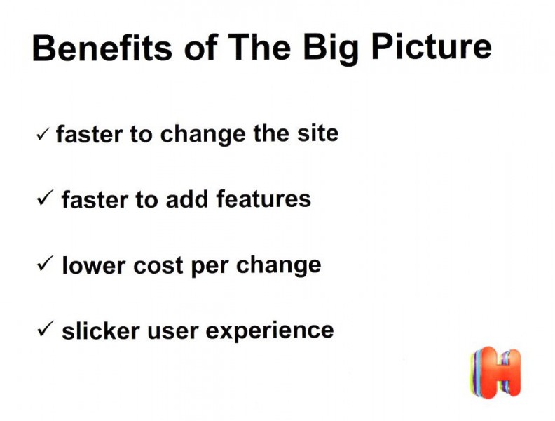
- faster to change the site
- faster to add features
- lower cost per change
- slicker, more consistent user experience
Outcome
Paola handed over the reduced user interface to Product Managers over 10 sessions, where she presnted the cut-outs, documentation and sketches.
Her Big Picture project was the first site-wide project of its kind for the company.
It reduced variation in the hotels.com user interface by 91% and was a catalyst for the complete design of the web site.
