Sysao web site design
Create and document a site redesign in the form of page templates.
Sysao wanted to replace their existing web site with one that would help generate new business, and support existing customers and partners. They wanted marked-up web pages for each page type and a style manual.
Paola's company was recommended by marketing consultant, Margo Rosenberg, to help design a site that Sysao could then construct, host and maintain.
They had launched a number of web sites without much success. The latest site was quite text-heavy, it was not registered on any search engines, it wasn't spider-friendly, nor linked from other web sites. Visitors had complained that the site was slow to use.
Sysao was a fast-growing, young and successful company; they provided Oracle solutions based on applications developed by Sysao. Sysao has expertise in specific areas and has developed systems to support them, such as financials, customer relationship management and human resources.


Planning workshop
The project started with a two-day workshop that Paola ran for Sysao and Margo Rosenberg, their marketing consultant. The workshop was used to discuss and plan site goals, target audience, content, functionality and site structure.
Once a list of content and functionality was formed, the group prioritised them to determine what would be in the first phase of the web site.
After the meeting, Paola documented the requirements in the form of a table of pages and a site structure diagram. She marked pages according to whether they'd be included in the first or next phase of the web site.
Design routes
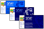
Paola called in graphic designers, Denison Design, who supplied a Creative Director, a Senior Designer and two Graphic Artists to the project. She requested that design routes be presented by showing the home page, two section pages and a page a lower level in the site.
Six design routes were created, all initially presented as marker sketches. By presenting routes on paper, rather than on screen, more routes were available within the budget.
Sysao's existing printed materials used navy and a water-like image; Denison incorporated these themes in the routes.
Sysao picked two of the six routes to take forward to the next stage.
Denison mocked up home page variations of the two chosen routes; Sysao decided on a route with clean white pages and a water theme.
Visual design stage 2: development of Head route by Denison Design
Colour and shape landmarks
Ten sections had emerged during the planning phase; a section is a group of pages which is linked from all pages on the web site.
The sections were grouped by importance and type, resulting in three levels of prominence. Paola briefed the designers to convey grouping, prominence and landmark cues through the visual design.
Most sites today implement section links in plain HTML or as text graphics. Whilst HTML links are the easiest to implement change and to download, they are the hardest to add visual cues of grouping and to provide structural landmarks.
Button graphics of text have the advantage of being of a predictable type size and typeface. But text in graphics cannot be resized or translated into another language. Graphical-only links also require more skill to create and maintain.
For these reasons, Paola continued with her practice of associating unique colours and shapes to graphical buttons accompanied by separate text links.
The addition of colour and shape allows seemingly decorative graphics to convey brand whilst also providing navigational and landmark cues.
Colour is recognised before shape, and shape is recognised before a text link. Shape- and colour-coded sections make a site easier to navigate by allowing quicker answers to the typical scenarios of "what section am I in?", "am I still in section (x)?" and "how do I get to section (y)?".
The three groups of section buttons in the Sysao design were conveyed by size, position, shape style and colour schemes.
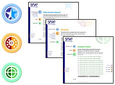
Icon development
The icons used in the button graphics went through several stages of design and refinement by the designers before final graphics were created by a graphic artist.
Button style was represented in a raw form initially and was just one part of a general design route. Although the icons were abstract, thought went into the design.
At the initial design briefing, we discussed possible icons with the designers, such as using a five-pointed star for "Why choose us" to represent the gold star students received in class for good work.
The original solution finder icon was reused for the services section and a new target/radar icon was used for the solution finder.
At the last stage, the final graphic was drawn in the chosen colour.
Development of abstract icons for the three main sections: 1) Why choose us 2) Services and 3) Solution finder
![]()
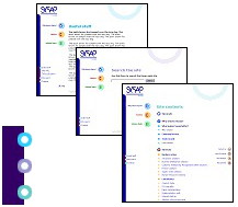
Section groups
The three main section button graphics included the most diverse range of colours - blue, orange and red - were the largest size, and the first set of buttons on the page (top-left of the page).
The icons were drawn as different abstract shapes but were not completely arbitrary (e.g., the icon for the solution finder was target-like crosshairs).
Three main sections using different hues and abstract shapes
For the second group of sections, buttons were smaller, icon shapes were less complex, used abstract water shapes and were in similar hues.
The section colour was used in page headings and a version of the section shape appeared in the top-right corner.
Four medium-prominence sections using smaller shapes with a water theme and in similar hues
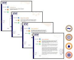
The group of the general site links were in a simple ring style and in similar hues based on the main blue theme.
Three site sections - simple ring shapes in blues
Button stats
Selected and unselected versions of the icon graphics were created to help convey the section of the current page. "Selected" means that a page is in the section. We chose the animation styles and created the animated mouseovers for the three section buttons.
Despite the number of graphics created for general use of the site, we worked hard to reduce them to the smallest file size whilst maintaining image quality.
Accounting for all mouseovers, the home page contained 30 site graphics totalling 50K. An inner page added an extra 7 graphics totalling just 5K (if an inner page was accessed first in a visit, it contained 30 site graphics totalling 30K).
| unselected + clickable | selected + unclickable | clickable + mouseover |
![[Why Sysao button - unselected]](/sites/default/files/sysao-b-whys0.gif) | ![[Why Sysao button - selected]](/sites/default/files/sysao-b-whys1.gif) | ![[Why Sysao button - frame from mouseover animation]](/sites/default/files/sysao-b-whys-a.gif) |
![[Services button - unselected]](/sites/default/files/sysao-b-serv0.gif) | ![[Services button - selected]](/sites/default/files/sysao-b-serv1.gif) | ![[Services button - frame from mouseover animation]](/sites/default/files/sysao-b-serv-a.gif) |
![[Solution Finder button - unselected]](/sites/default/files/sysao-b-solf0.gif) | ![[Solution Finder button - selected]](/sites/default/files/sysao-b-solf1.gif) | ![[Solution Finder button - frame from mouseover animation]](/sites/default/files/sysao-b-solf-a.gif) |
Construction
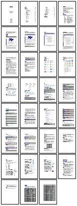
Once the web graphics were completed, we created over twenty web page templates representing each page type. These web page templates differed from actual web pages only by the absence of final copy.
Templates included the format of search results following a site search. We also provided sample pages for the solution finder, one of the three main site sections. This was identified in the requirement workshop as a goal-driven way to find out about the company's services.
The solution finder was a specialised site search. Specific pages on the site would be associated with goal questions. The solution finder would pose these questions alongside checkboxes. A visitor was to tick those boxes that applied. On submitting the form, the form would redisplay after an annotated list of pages on the site which addressed the ticked questions.
Sysao was to program the solution finder and so we did not implement it. However, we did document the data structures and processing required to implement it.
Style guide and manual
Paola prepared an illustrated 28-page style guide and manual.
The manual described how the pages were constructed with tables and listed special mark-up used. The house style was then documented: it explained the use of colour and graphics, link styles, how depth was conveyed through design, link style and a writing style.
The redesigned site was launched in July 2000.
")
")
")
")
")
")
")
")
")
")