CRASH web site redesign
Redesign the home page, headers and sidebar of the web site.
In 2005, Paola redesigned the CRASH home page to make it work harder. She adjusted the page colour scheme and made some improvements to the general page layout.
The requirements were to:
- Redesign the home page
- Change the top blue band to red
- Narrow the side navigation panel
- Design the new Hard Hat Appeal page
The design was an iterative process using mock-ups. When the design was agreed, Paola updated the code which generated web pages.
Home page redesign
CRASH had clear ideas about what should be on the new home page and provided printed examples from other web sites showing introductory text and news items.
The original home page included an animated image of project photos and the latest two news items but otherwise looked like an inner page.
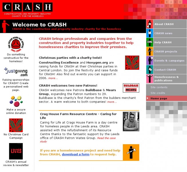
Paola created a two-column layout, the first with logos for campaigns and publications in the first column. In the process, she designed a logo for the No Christmas Card Campaign.
The main column contains a bold introductory paragraph - replacing all of the previous content - the latest two news items and a panel for a featured project.
We agreed that there should be a graphic for each news item. Paola created these for the archived items and created two generic photos to use when a graphic wasn't defined for a news item.
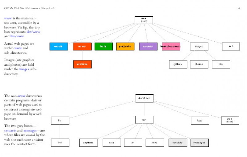
Content for each area section of the page is held in separate files. This means that CRASH only update those files that change and never edit the actual web page.
Red colour scheme
Acumen Marketing Communications have provided design services to CRASH for the last few years and had created a strong brand for CRASH publications and literature which involves red, black and white.
CRASH wanted the to feature red in the web site by changing the top panel at the top of pages in blue with the logo to red. The change made a dramatic and stylish change.
Paola also put the page headings on a black background instead of the original section colour so that the colours would not clash with the red.
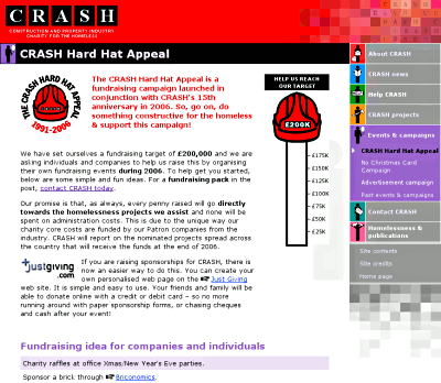
CRASH home page, before the redesign
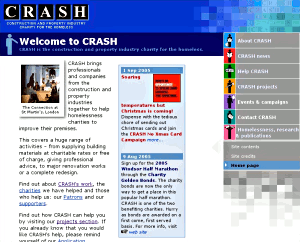
Redesigned home page

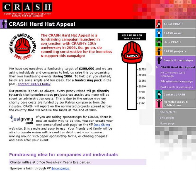
Hard Hat Appeal
2006 was CRASH's 15th anniversary and the Hard Hat Appeal is a year-long campaign to raise £200,000.
CRASH asked Paola to design the appeal page: a short version for the start of the appeal and a full version with photos and more information for when money had been raised.
The page included a 'thermometer' which shows how much of the money has been raised. This is displayed by the use of stretched GIFs.
Money raised is represented by a red bar. To update the thermometer, CRASH merely entered the amount raised at the top of the content file; Paola's code then automatically calculated how to display the graphics.
