Paola Kathuria web site
Design history
My first web site was launched in 1994 at www.limitless.co.uk/~paola. I redesigned it in 1996 to have a black background and did a minor redesign in 1998. The new design for paolability.com was done in 2004. I worked on building the site off and on since then, finishing in 2006.
I redesigned and rebuilt in Drupal in 2019.
Built from scratch
 From 1995 to 2019, the site was implemented in LML - Limitless Mark-up Language - which meant that I build the site from scratch. Page information is in a spreadsheet saved to a CSV file.
I created a page template and wrote a script to generate complete web pages to upload to the server.
My personal site included a shop for my jewellery since 2004.
Previous design 1996-2006
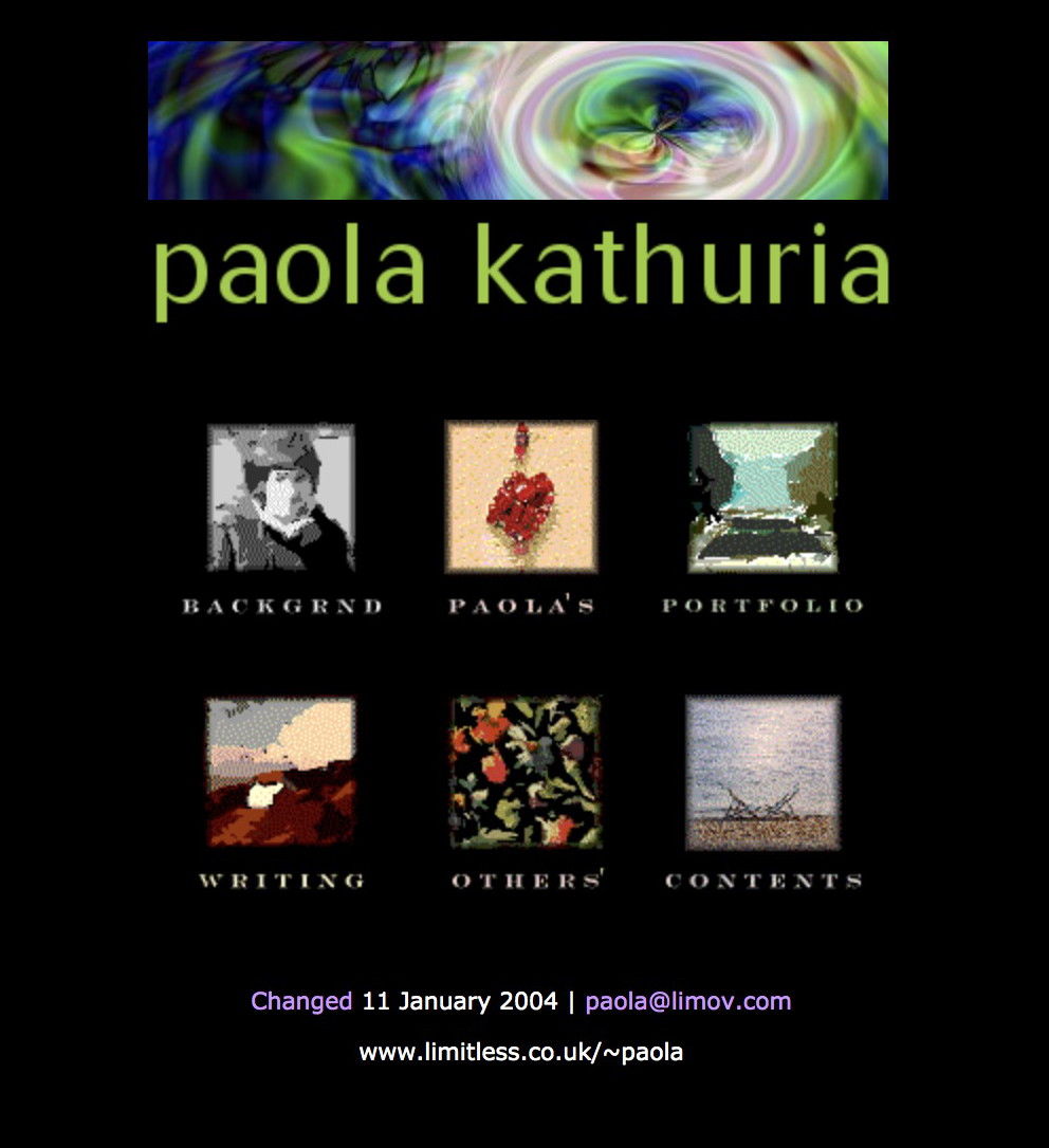
My web site had black page backgrounds and section buttons based on photos and imagery used on the site. I applied a filter to unselected section buttons to give them a painterly feel. Selected buttons were in the original photographic style. The 2002 redesign removed my photo from the home page and several sections of the site.
Navigation design
Apr 1998: I experimented with colour-coded graphical buttons based on rounded images based on my collection of images created with KPT 3.
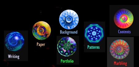
Apr 1998: Different colour-coded graphical buttons. The graphic in the navigation for the current page would be empty. The section graphic would be incorporated in full in a graphical page heading; the buttons would show crops of the images. I liked it but didn't want to make images for every heading.
Sep 1998: I got bogged down with 'web-safe' backgrounds for a while and created a set of colour- and graphic-coded section backgrounds using font characters based on left-hand navigation.


Jun 1999: I coloured a photo I'd taken of a London bridge at night and tried making it into a background tile.
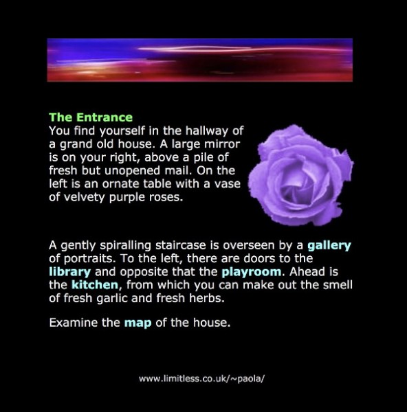
Mar 2000: I tried a MUD route. In old text-based games such as Adventure and MUD, you explore a fantasy world. Each location ('room') is described in a standard format:
You are at the edge of the forest. In the distance you can see smoke rising. A brook babbles nearby. On the ground you see a stick. There is a rabbit here.
My idea was to write a description for each web page. Navigation would be by interacting with the found objects (clicking on links). I think it's a cute idea but it's totally unusable as the page is unskimmable.

Asking for professional help
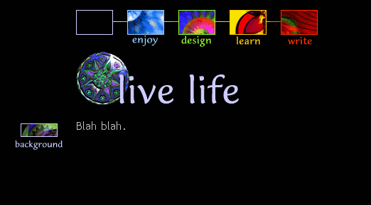
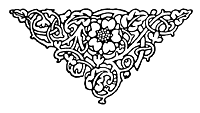
Jun 2004: I decided to ask for help from a proper designer. I approached Francois Jordaan, who I'd originally met via the chi-web mailing list. He'd freelanced for us the previous year in the oed.com redesign [case study]. The design originally included section graphics based on typographic ornaments and I knew I wanted ornaments in my new site.
I mailed to ask if he would help, sending some of my favourite images from my Dover books of royalty-free images.

Jun 2004: I sent Francois a mock-up of my latest page design. As usual, I wanted to colour- and graphic-code each site section. I'd done as much as I could and wanted help to make more use of the decorative images and to make the design professional since I planned to add a shop to the site.
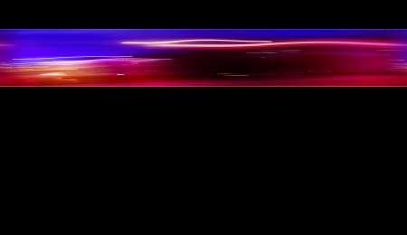
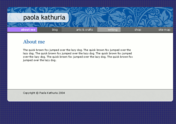
Jun 2004: Francois's first reworking was already a vast improvement. The deeper colours and decorative page background were gorgeous. However, I could not think of a way to implement the vignetted background.
Design routes from Francois
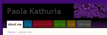
Jul 2004: Francois then sent me three different design routes. The first was interesting and I loved the big decorative graphic but I wanted the tabs to be colour- and section-coded.
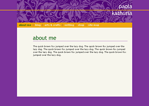
Jul 2004: Francois's second route was also interesting. Great colours and lovely large graphic. But, again, the tabs had to be colour- and graphic-coded even when unselected to help people find their way back to a section they'd visited.
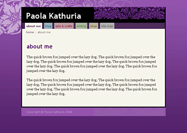
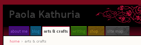
Aug 2004: Based on my feedback, Francois sent back four new mock-ups for different page types, with two options for the tabs, one which included the section graphic.
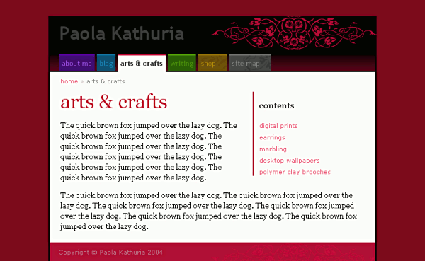
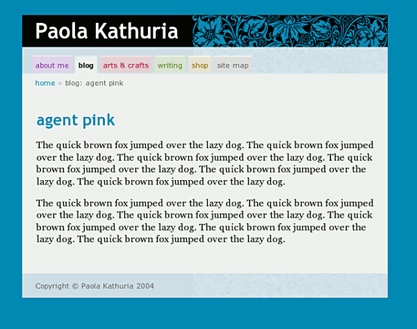
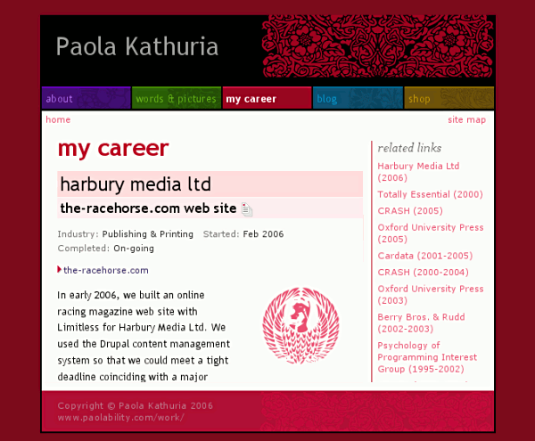
Aug 2004: I tweaked the design and implemented it in HTML and CSS. I sent a web page and style sheet to Francois to tidy up. This is a screenshot of the web page I sent. Before this point, the designs were in the form of images.
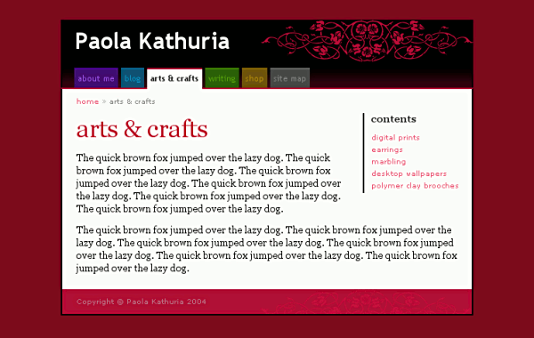
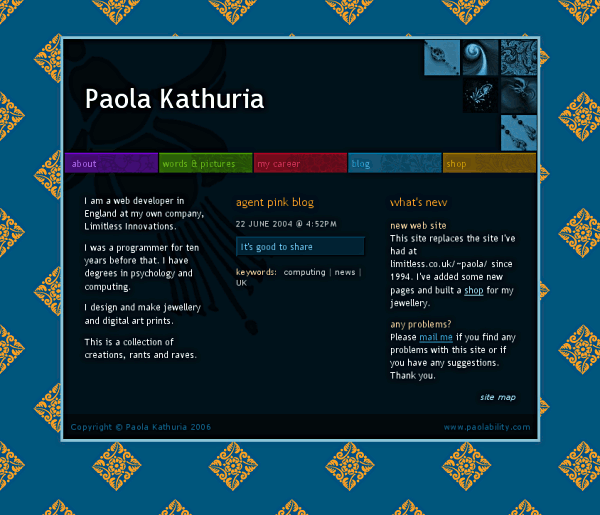
Aug 2006: This is what the red section page looked like at relaunch at paolability.com.
Home page
Sep 2004: Happy with the inner page design, I asked Francois to help with the home page. I knew I wanted thumbnails to go to random parts of the site. I said "wow!" when I saw his two suggestions.
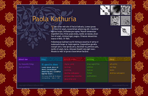
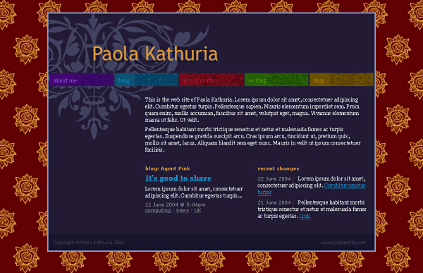
Sep 2004: This version didn't include the thumbnails. But both introduced the stretched tabs with incorporated section graphic. I adapted them for use in the whole site. I combined Francois's ideas into a new version with my colours.
Aug 2006: This is the home page design in August 2006. See the site as it was in 2006 on the Wayback Machine.